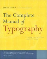
The Complete Manual of Typography
How type should look and how to set it as a professional does.
Summary
James Felici explains how type should look and how to get it to look that way, which amounts to setting type as a professional does. He gathers the craft knowledge that once lived almost only in the minds of people who worked in type shops. Those shops have closed and the technology has changed, yet the aim of good, well-set type has not, and Felici shows in practical terms how to reach it with today's computer tools.
The manual sets out the history of typography, its basic concepts and the anatomy of good type in short, indexed sections. Designers, print production staff and corporate communications managers can look up answers in the index, and teachers and students can read it through as a textbook. Felici covers managing fonts and repairing corrupt or missing ones; measure, point size, leading, kerning, hyphenation and justification; fixing widows, orphans, loose lines and bad rags; and indents, alignments, wraps and tables. Frank Romano of RIT, Roger Black of Danilo Black, Inc. and Erik Spiekermann, author of Stop Stealing Sheep, all praised it.
Key takeaways 4
- Good typesetting follows craft rules once passed on inside type shops.
- Today's software can produce professional type if its user knows those rules.
- Measure, point size, leading, kerning and hyphenation are the fundamentals a typesetter must control.
- The manual works both as a quick reference and as a textbook.
Who should read it
Designers, production staff and students who set type.
Who recommended it 1
Similar books 6
Chosen by shared topics, the entries that hold them, and the people who recommended both.
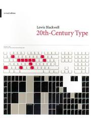
A history of typography and type design through the twentieth century.
Recommended by: Jeremiah Shoaf
39 hand-printed alphabets from a designer's collection of wood-letter founts.
Recommended by: Jeremiah Shoaf
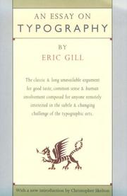
An essay on typography, lettering, book design and the social side of printing.
Recommended by: Patrick Collison, Jeremiah Shoaf
Typography for web designers and developers: rhythm, scale and page composition.
Recommended by: Jeremiah Shoaf
An introduction to typefaces, type and page layout.
Recommended by: Jeremiah Shoaf