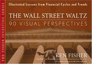
The Wall Street Waltz: 90 Visual Perspectives, Illustrated Lessons From Financial Cycles and Trends
Summary
Ken Fisher assembled ninety charts of long-run financial and economic data and wrote a short commentary on each. The book's premise is that most investment beliefs collapse when confronted with a long enough data series, and that a chart makes the point faster than an argument.
The charts cover long series on interest rates, inflation, equity valuations, dividend yields, commodity prices, government debt, currency values, price-earnings ratios and market returns, many of them extending back into the nineteenth century. Fisher uses them to attack specific beliefs: that current debt levels are unprecedented, that current valuations are extreme, that inflation follows deficits reliably, that particular indicators forecast market direction.
His method is to show that whatever condition currently alarms investors has occurred before with varying consequences, and that the relationships people assert are weaker in the data than in the commentary. The book has been revised across editions to extend the series. Its weakness is that Fisher's commentary sometimes overstates what a chart establishes, and that showing a condition has occurred before does not establish that its consequences will be the same. The assembly of long historical series in visual form is genuinely useful and unusual, and the discipline of looking at a long series before forming a view is the right one.
Key takeaways 7
- Conditions that alarm investors as unprecedented have almost always occurred before with varying consequences.
- Long historical data series show weaker relationships between economic indicators and market returns than commentary asserts.
- Government debt levels described as unprecedented have been exceeded in earlier periods without the predicted outcomes.
- Fisher argues that looking at a long series before forming a view is the single most useful research discipline available.
- A chart establishes that something happened and does not establish why or whether it will happen again, which Fisher sometimes elides.
- Valuation measures presented as extreme are frequently within historical ranges once the series is extended far enough.
- The visual assembly of long financial series is unusual and useful independently of the commentary attached.
Who should read it
Investors who want long historical data series in visual form as a check against claims that current conditions are unprecedented.
About Ken Fisher
Founder and Executive Chairman, Fisher Investments; Forbes "Portfolio Strategy" columnist 1984-2016
A long, public money-management record plus Super Stocks, which introduced the price-to-sales ratio and outlived its news cycle.
Where it sits in the reference 2
Similar books 6
Chosen by shared topics, the entries that hold them, and the people who recommended both.