
Refactoring UI
Where most design books stay in the abstract, this one opens with specific visual decisions: spacing scales, type hierarchies, color palette construction, shadow systems. Written by developers who taught themselves visual design, it's unusually practical and works equally well for product designers who want stronger visual intuition.
Summary
Wathan and Schoger wrote this for developers who need to design interfaces and have no design training. It is organised as a set of specific, applicable tactics rather than as design theory, with before-and-after examples for each.
The substantive advice covers hierarchy, spacing, typography, colour, depth and imagery. On hierarchy they argue that most amateur interfaces fail because everything has the same visual weight, and they give concrete methods: use font weight and colour rather than size to create distinction, de-emphasise supporting text rather than emphasising primary text, and label content only when the label carries information. On layout they argue for starting with too much white space and removing it, for sizing elements by content rather than filling the available width, and for designing the mobile layout in a desktop-width window to avoid cramped thinking. On colour they set out how to build a palette using HSL, why lightness must be varied along with hue, and how to generate the eight to ten shades of each colour a real interface needs. On typography they cover choosing typefaces, line length, line height and the specific problem of vertical alignment.
The book is compact, entirely practical, and it produces visible improvement quickly, which is why it circulates among founders building their own products. It teaches tactics rather than design judgement, so it will not make a reader a designer. Its aesthetic is specific to the mid-2010s web application style, and interfaces built strictly by its rules look similar to each other. It also predates the current design systems and component library practice, though the underlying principles about hierarchy and spacing are not affected.
Key takeaways 7
- Interfaces fail most often because every element has equal visual weight, and establishing hierarchy is the single highest-value change.
- Hierarchy should be created with font weight and colour rather than with size, because size differences quickly become crude.
- De-emphasising secondary content works better than emphasising primary content, since it avoids inflating the whole interface.
- Start a design with more white space than seems necessary and remove it, because the common failure is cramped layout rather than sparse layout.
- A usable colour system needs eight to ten shades of each hue, and generating them requires varying saturation and lightness together rather than mixing with grey.
- Elements should be sized to their content rather than stretched to fill the available width.
- Choosing a typeface matters far less than setting line length, line height and weight correctly, and most typography problems are spacing problems.
Who should read it
Founders and developers who build product interfaces without a designer and need immediately applicable tactics.
Who recommended it 2
Similar books 6
Chosen by shared topics, the entries that hold them, and the people who recommended both.

Krug's web usability primer has stayed relevant for over two decades because its core argument — that good interfaces require no instruction — is timeless. The chapters on navigation conventions and usability testing with five users are still the most practical introduction to the discipline.
Recommended by: Brian Armstrong, Andy Budd, Austen Allred and 6 others

A four-step model for habit-forming products: trigger, action, reward, investment.
Recommended by: Nat Eliason, Alexis Ohanian, Andrew Chen and 6 others
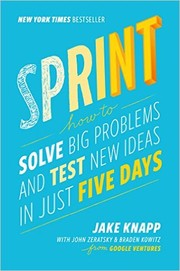
The Google Ventures five-day workshop format distilled into a repeatable method for answering critical design questions through rapid prototyping and targeted user testing. Less a design book than a process book — most valuable for teams that struggle to move from ideas to validated decisions quickly.
Recommended by: Andy Budd, Jessica Hische, Marty Cagan and 1 other
The book that introduced affordances, signifiers, and feedback loops to a generation of designers. Norman's analysis of why doors, phones, and stoves confuse people is the clearest argument that bad design is a systems failure, not user error. Everything else on this list builds on this vocabulary.
Recommended by: Ran Segall, Andrew Chen, Garry Tan and 9 others

Organized as short research-backed chapters on how people see, remember, decide, and feel, this is the most accessible bridge between cognitive science and design practice. The sections on peripheral vision, progressive disclosure, and intrinsic motivation are particularly applicable to interface work.
Recommended by: Jan Losert, Johnnie Gomez, Nir Eyal

Goal-directed design and personas: fitting software to how users think it works.
Where it sits in the reference 2
Topics