
Don't Make Me Think
Krug's web usability primer has stayed relevant for over two decades because its core argument — that good interfaces require no instruction — is timeless. The chapters on navigation conventions and usability testing with five users are still the most practical introduction to the discipline.
Summary
Krug wrote a short book on web usability whose central rule is that a page should be self-evident, so that a user never has to work out what something is or where to click. He argues that users do not read pages, they scan them; that they do not make optimal choices, they satisfice by clicking the first plausible option; and that they do not figure out how things work, they muddle through with a partial and often wrong model.
The practical guidance follows. Pages should have clear visual hierarchy, conventions should be followed rather than reinvented, clickable things should look clickable, pages should be broken into defined areas, and noise should be eliminated. Krug argues for cutting half the words on every page and then half again. Navigation should answer where am I, and every page needs a name matching what the user clicked to get there.
The usability testing chapters are the most valuable part. Krug argues that testing three users early and repeatedly finds more problems than testing many users once, that the tests can be run informally and cheaply, and that the point is to observe where people get stuck rather than to validate a design. He gives a script and a procedure that a team can run in a morning.
The book was written for web pages and later editions add mobile, but the examples are dated and some conventions have changed. It contains no research of its own, and the claims come from Krug's consulting practice. It remains the shortest useful introduction to the subject, and its argument about testing cheaply and often has been more influential than its specific design rules.
Key takeaways 8
- A page should be self-evident, so that a user does not have to spend any effort working out what things are or where to click.
- Users scan pages rather than reading them, and design should assume that most text will never be read.
- Users satisfice by choosing the first plausible option rather than evaluating alternatives, which means the first plausible option must be the right one.
- Following established conventions costs nothing and saves the user the effort of learning a new pattern, so novelty in navigation is a cost rather than a feature.
- Removing half the words on a page and then half again improves comprehension without losing content.
- Testing three users early and repeatedly finds more problems than testing a large number once at the end.
- Usability tests should observe where people get stuck rather than ask them what they think, because stated preferences do not predict behaviour.
- Arguments about design preferences inside a team are unresolvable without testing, since everyone is reasoning from their own use rather than from users.
Who should read it
Founders and product teams shipping anything with an interface who want the shortest usable guide plus a cheap testing procedure.
Who recommended it 9 · 1 direct
Similar books 6
Chosen by shared topics, the entries that hold them, and the people who recommended both.
The book that introduced affordances, signifiers, and feedback loops to a generation of designers. Norman's analysis of why doors, phones, and stoves confuse people is the clearest argument that bad design is a systems failure, not user error. Everything else on this list builds on this vocabulary.
Recommended by: Ran Segall, Andrew Chen, Garry Tan and 9 others
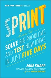
The Google Ventures five-day workshop format distilled into a repeatable method for answering critical design questions through rapid prototyping and targeted user testing. Less a design book than a process book — most valuable for teams that struggle to move from ideas to validated decisions quickly.
Recommended by: Andy Budd, Jessica Hische, Marty Cagan and 1 other

A four-step model for habit-forming products: trigger, action, reward, investment.
Recommended by: Nat Eliason, Alexis Ohanian, Andrew Chen and 6 others
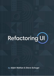
Where most design books stay in the abstract, this one opens with specific visual decisions: spacing scales, type hierarchies, color palette construction, shadow systems. Written by developers who taught themselves visual design, it's unusually practical and works equally well for product designers who want stronger visual intuition.
Recommended by: Charlie Marie Prangley, Jordan Hughes

Organized as short research-backed chapters on how people see, remember, decide, and feel, this is the most accessible bridge between cognitive science and design practice. The sections on peripheral vision, progressive disclosure, and intrinsic motivation are particularly applicable to interface work.
Recommended by: Jan Losert, Johnnie Gomez, Nir Eyal

Goal-directed design and personas: fitting software to how users think it works.
Where it sits in the reference 2
Topics