Updates

  1. Person pages list letters, writing, profiles and links as sortable tables with filters, and show each person's companies as links; Fund letters show each letter's description in its own column.
  2. Experts show a checked job title and a short description of each person; 30 more people have photographs.
  3. Every company, fund, university and publication the experts work for has a page listing the people there.
  4. Fund letters show each letter's thesis and filter by it; 225 person pages list the essays, columns and newsletter issues the person wrote.
  5. Person pages list every essay and newsletter issue a person wrote, and their own books as a table in List view.
  6. Recommends shows the five largest kinds of book and the rest under More; browse pictures load sooner.
  7. Podcasts and talks link the original episode, filter by Audio and video or Press, and list each publisher once.
  8. Pages are wider, Recommends has List and Grid, and a filter clicked again turns off.
  9. Book cards sit in a ruled grid with Open Library and Goodreads links and each book's one-line note.
  10. Funds is now Investors; each investor's styles are buttons that filter the table.
  11. Podcasts and talks on a person's page filter by year and publisher and show as a list or a grid of pictures.
  12. Quotes show only people's own words: 472 summaries written by list sites are gone.
  13. Country pages open from Browse again, and every link on the shelf lands on a page.
  14. Subject and person pages show their sections as tabs, and each book appears once on a person's page.
  15. Book cards show the quote, who said it and the source; grids show five cards to a row.
  16. On a phone, a menu holds the sections, search, Updates, Feedback and dark mode.
  17. Feedback takes a screenshot of the page with no browser prompt, opens a screenshot full size when you click it, and clears itself once sent.
  18. Book cards are centred, search names the topic each book sits in, and any text cut short shows whole on hover.
  19. Search groups its results by kind: people, companies, geographies, subjects, topics, books, funds, fund letters and papers.
  20. The Books table lists who recommended each book by name, and the browser tab names the section you are in.
  21. Feedback can take a screenshot of the page, or one you paste or choose, and opens in the corner beside Updates.
  22. Each rail button reopens its section where you left it, and Browse, Table and People show on every book and subject page.
  23. Filters grey out choices that hold nothing instead of hiding them, and Books › People filters by authors or recommenders.
  24. Feedback takes a subject line and up to three screenshots.
  25. Biographies are grouped by the person they are about: 41 new pages, from Abraham Lincoln to Lee Kuan Yew.
  26. Sport splits into 23 sports, and Religion into one topic per faith.
  27. Book lists show as cards: the cover, one recommendation quote and every recommender by name.
  28. Seventeen subjects that had two or three pages under different names now have one page each.
  29. Every page lists its Experts as authors and recommenders, with a link to them on the Experts tab.
  30. Economics, Financial history, Financial panics and Accounting are subjects of their own, with one page per financial crisis.
  31. Book, person and subject pages open inside the app, so the tabs stay in view.
  32. 996 more book covers, and photographs or logos for 227 more people and companies.
  33. Books › Browse shows every subject as cards, and the rail holds Fund letters, Papers, Experts, Books and Funds.
  34. Every topic over 150 books splits into narrower topics, each with a page of its own.

Send feedback

What is it?
Screenshots, up to 3 (optional)
or paste one with Ctrl+V

We use your email only to reply to you.

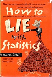
How to Lie with Statistics

How to Lie with Statistics

Darrell Huff
1954
T1 142 pages · about 2h 22m to read Open Librarygoodreads

Summary

Huff wrote a short illustrated book in 1954 cataloguing the standard techniques for producing misleading numbers. It covers biased samples, the difference between mean, median and mode, the omission of sample sizes and confidence intervals, the truncated y-axis, the one-dimensional picture used to represent a doubling as a fourfold visual increase, post hoc reasoning about causation, and what he calls the semi-attached figure, where a number is presented as evidence for a claim it does not support.

The examples come from mid-century advertising, journalism and market research, including toothpaste claims, income statistics and public health reporting. The final chapter, on how to talk back to a statistic, gives five questions: who says so, how do they know, what is missing, did somebody change the subject, and does it make sense.

The book's usefulness is that the techniques have not changed. Every method Huff describes appears in modern startup metrics, in fund performance presentations and in public health reporting, with better graphics. The chart manipulation material applies directly to any dashboard, and the biased sample chapter applies to every customer survey.

There are two problems. Huff himself later testified for the tobacco industry, arguing that the statistical link between smoking and cancer was the kind of correlation his book warned against, which is a serious mark against his judgment and shows how the book's scepticism can be misused. The statistics are elementary and the book will teach nothing to anyone with quantitative training. Some examples and the illustrations are dated. It remains the best short introduction to numerical scepticism for a general reader.

Key takeaways 8

  1. A sample that is not random produces a number that describes only who responded, and the selection method is usually omitted from the report.
  2. The word average conceals which measure is being used, and mean, median and mode can be chosen to support opposite conclusions from the same data.
  3. A number without its sample size or its margin of error cannot be evaluated, and both are routinely omitted.
  4. Truncating a chart axis exaggerates a change, and the technique is used more often than any other because it survives casual inspection.
  5. Representing a doubling with a picture scaled in two dimensions produces a fourfold visual impression, which is deliberate rather than careless.
  6. A correlation is presented as a cause by simply describing it in causal language, without any claim being made that could be checked.
  7. A figure that supports one claim is frequently presented as evidence for a different and larger claim.
  8. Any statistic should be checked by asking who produced it, how they could know, what has been omitted, and whether the conclusion follows from the number given.

Who should read it

Anyone reading fund performance, startup metrics or research summaries who wants a short catalogue of how numbers are made to mislead.

Who recommended it 9 · 5 direct

Jason Zweigreported

Similar books 6

Chosen by shared topics, the entries that hold them, and the people who recommended both.
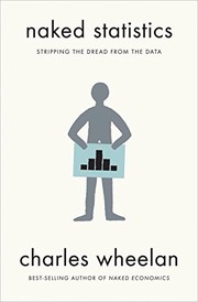
Charles Wheelan · 2013

Statistics without the maths, for reading claims: averages, correlation, regression.

Recommended by: Keith Rabois
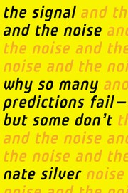
Nate Silver · 2012

Why some forecasts succeed and most fail, from weather to earthquakes and economics.

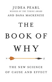
Judea Pearl, Dana Mackenzie · 2018

How the science of cause and effect moved past 'correlation is not causation'.

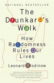
Leonard Mlodinow · 2008

How randomness shapes our lives, the history of probability, and why we misread it.

Recommended by: Patrick Collison
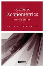
Peter Kennedy · 1998

What each econometric technique is for, what it assumes and what goes wrong.

Recommended by: Nassim Nicholas Taleb

Where it sits in the reference 4

Mental models
Mental models
Mental models
Mental models

Topics

Mathematics and StatisticsReference WorksStatistics, probability and dataScience, mathematics and medicine texts